2020 AIA Dallas Tour of Homes,
Dallas’ only citywide home tour,
is going virtual!
October 24 + 25, 2020
The digital tour showcases the work of some of the city’s most talented architects, highlighting innovative and outstanding residential design through plans, models, videos, and 360-degree virtual walkthroughs. Additionally, live virtual guided tours led by the architects are scheduled throughout the weekend with opportunities for design Q&A’s. Curated exclusively by local architects
Sumner Bohannon House // Malone Maxwell Dennehy Architects
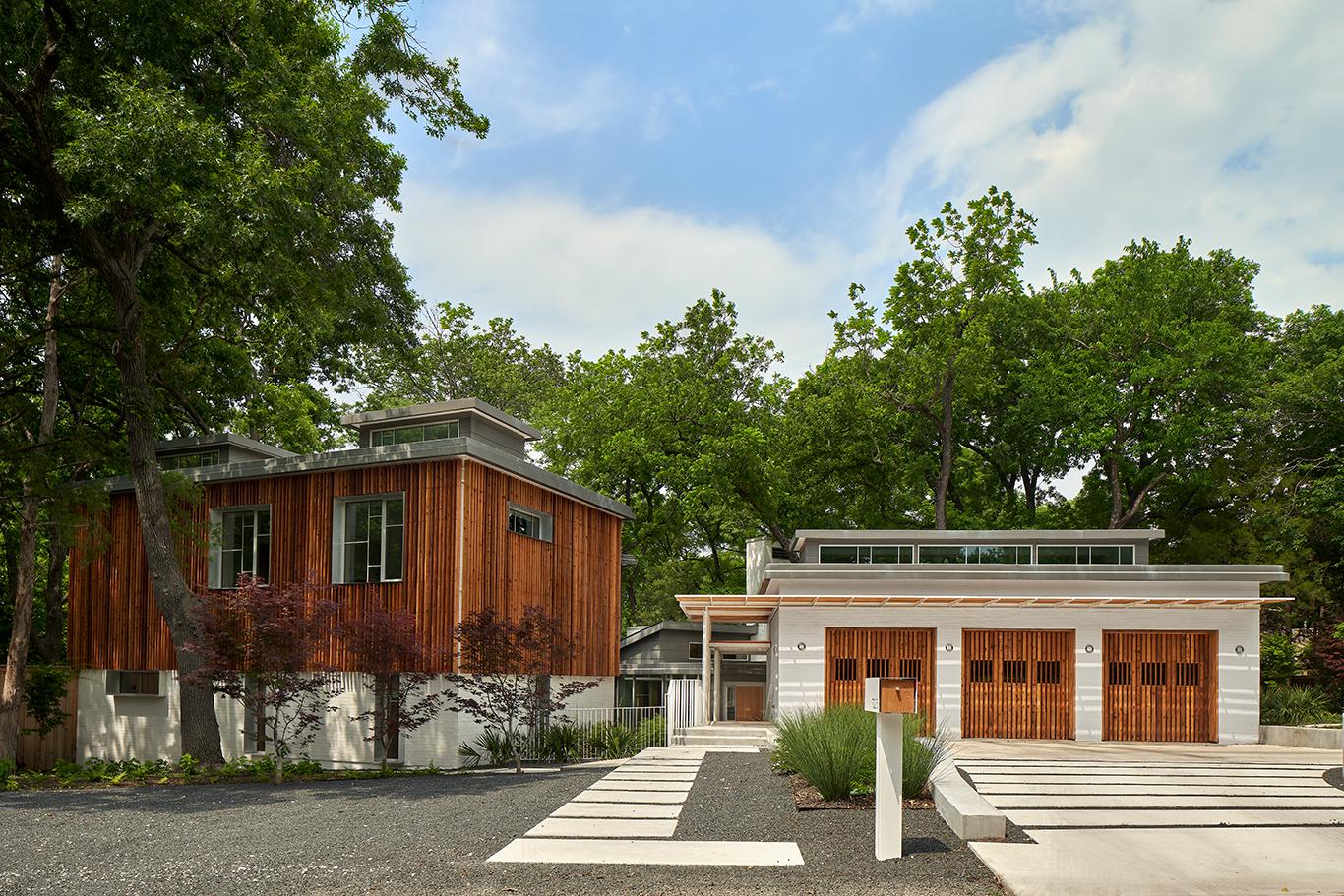
Built on a sloping, heavily wooded lot fronting a creek, the Sumner Bohannon House was designed to preserve over 50 mature trees and the Dallas property’s natural grade.
The new structure is largely built over the foundation of a home that had stood there since 1949. The detached garage, placed at the highest point on the site, is connected to the new house by a terraced stair, sheltered under a stepped steel and cedar pergola.
The entry to the house goes directly into a large living space, divided by a freestanding fireplace and millwork elements into a dining room and an upper and lower living room. A sculptural steel and wood staircase provides vertical circulation and acts as a hinge and screen between the public areas and the bedrooms.
To clarify the interior spaces and emphasize the views, the material palette is limited and consistently utilized throughout. Large-format terra cotta flooring anchors the ground plane, minimizing glare from the many windows. Clear-finished maple forms the basis for a variety of architectural expressions: millwork, paneling, and, most conspicuously, as the undulating ceiling plane of the living room. The wave metaphor is a lighthearted gesture to the creek beyond.
Decks are suspended between the house and retaining walls with cutouts around the trees. The native limestone cladding on the 1949 house was salvaged to use in the retaining walls that support the exterior decks, terraces, and pools.
Architectural Design Team: Michael Malone, FAIA; Danielle Anderson, Assoc. AIA; Erin Hackler, Assoc. AIA; and Amy Stewart, Assoc. AIA
House Reimagined // Bernbaum/Magadini Architects
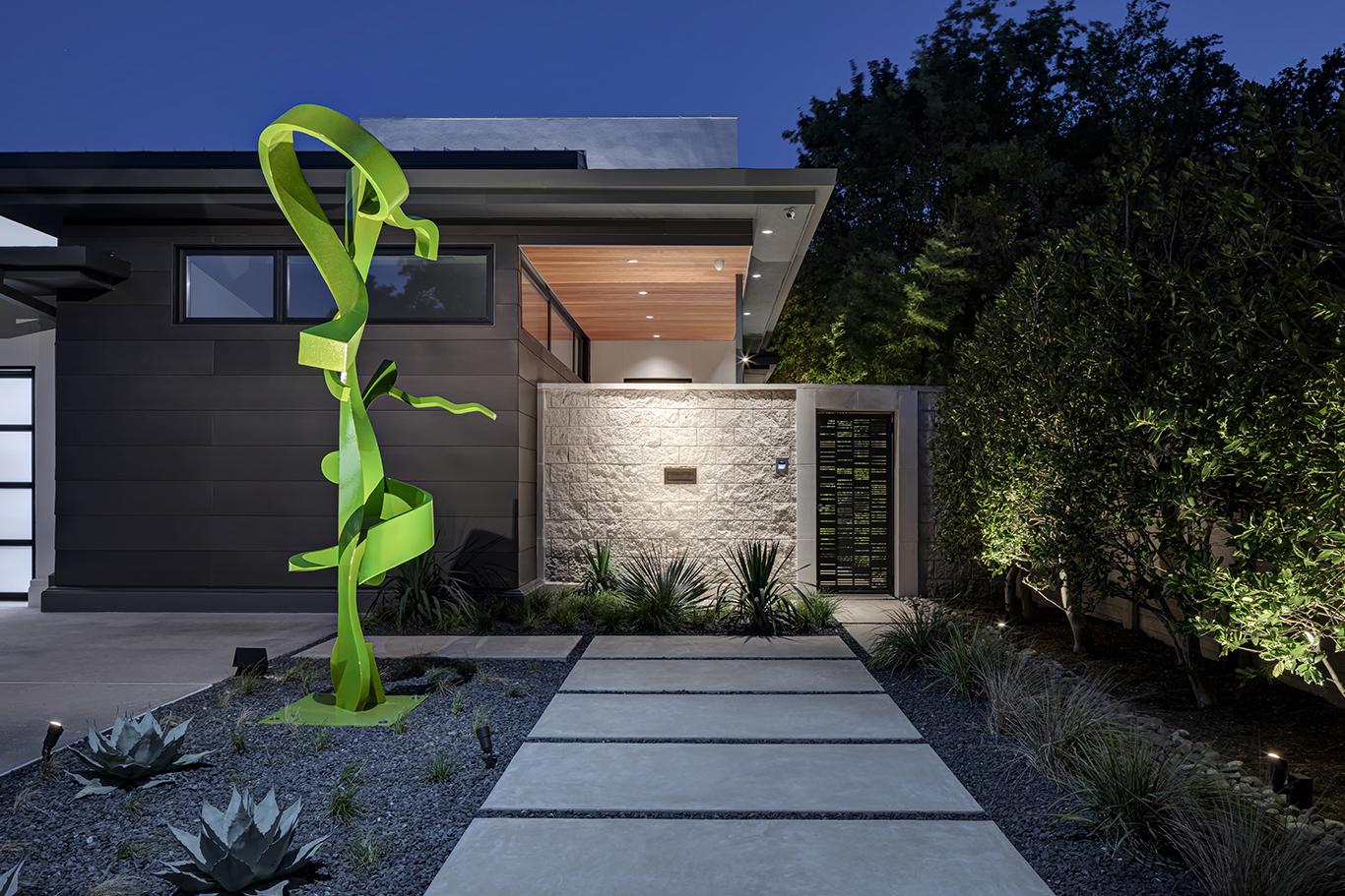
For Bernbaum/Magadini Architects, the challenge was to convert an unfriendly two-story residence, walled off and its back turned to its neighborhood, into an inviting family home.
The clients considered adding square footage to the first floor for a master suite so they could “gracefully age in place.” But as the program developed and the options were weighed, a creative design solution allowed the design team to reimagine the existing space. The architects realized that the first floor had sufficient area to convert its unused spaces to meet the clients’ new program.
The design team converted the garage shop into a study and utility area, which in turn allowed the existing study and exercise room to be converted into the first-floor master suite. This design, without adding square footage, saved time and expense as well as preserved the backyard pool court.
The architects visually softened the interiors by removing industrial lighting and acoustical ceiling panels throughout the residence. The interior finishes were upgraded and custom furniture was designed for the owners’ suite to conceal a pop-up television. The introduction of LED lighting completed the reimagined interiors.
The exterior facades were updated with G90 Paint Grip horizontal siding, refreshed stucco, and glass and metal overhead garage doors to give the home a contemporary feel. The landscape architect used similar materials to coordinate with the new exterior finishes. The landscape and the contemporary exterior combined to make an inviting, neighborhood-friendly project.
Strait Lane Residence // DGA - Douglas Guiling Architect
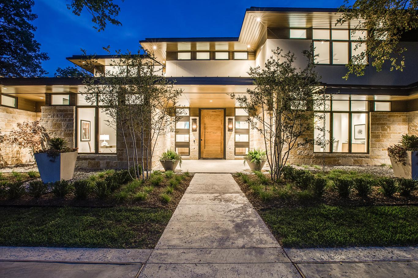
A 90-degree bend in Bachman Creek created multiple opportunities for this home in a North Dallas neighborhood. The inspiration of the natural setting lay the groundwork for a Modern Prairie design that ties in the site’s surroundings through large overhangs, horizontal window bands, earth tones, terraces, and outdoor living areas.
The home’s spatial experience and orientation of views are established by axial design elements that effortlessly direct you through the spaces. Corridors terminate with spaces for art, doors are hidden, and privacy is honored. Upon entering the front door, you are met with a large art niche that creates a sense of arrival and seclusion. As you walk farther, an opening draws you into the great room, where the view of the creek is framed by a large Mondrian assembled window wall. An earth tone pool and terrace lie outside the great room, with the creek beyond. At night, the twinkling pattern of the pool lights dances on the ceiling.
Proportions in the large rooms are regulated by Phi geometrical relationships, which help make a large space feel comfortable. This ancient proportioning trick offers height and width relationships the same as those of the human body. In too many instances today, spaces are uncomfortably proportioned, and when the front door swings open, the design mystery revealed as the “open plan” falls flat.
The views from the master suite are like those of the great room. Awaking in bed to a Mondrian view down the creek can make even Monday morning something to look forward to.
Knowing that “home” is a place where we grow up and grow old, we have always felt that our designs need to satisfy psychological needs. The subliminal comfort of spaces and details are important, thus we avoid cold, monochromatic brutalistic designs.
The floor plan lends itself to entertaining with bar, buffet, and catering kitchens so that public areas remain clean during a soiree.
Nimbus Prototype // NIMMO
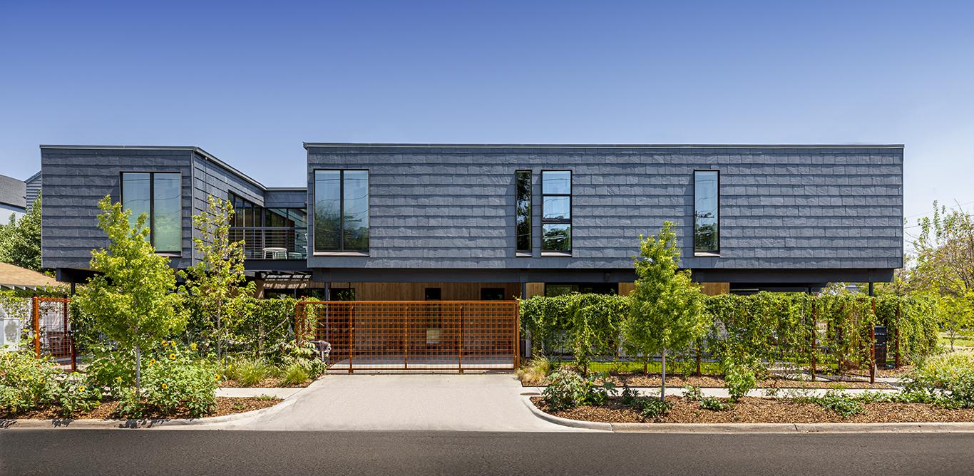
Nimbus Prototype is a flexible, urban-infill prototype set in the Bishop Arts District of Dallas. The owner wanted a residence that would be multigenerational but that also could be used for a short-term rental. The design team strived for spaces that allowed both connection and privacy for the parents, children, and grandparents.
The design solution is a duplex, with the matching units rotated 90 degrees from each other. The rotation of the units takes advantage of the corner lot and gives each home its own front yard. While the kids can visit their grandparents through the garden fence, the units feel like independent homes.
The house connects the residents to their outdoor space while maintaining privacy in the dense, pedestrian-friendly neighborhood. The home is raised on stilts, with the main living areas on the second level. The first level is finished out to be flexible, used either as bedrooms or as a rental suite complete with a kitchenette. Raising the house on stilts provides voluminous covered outdoor spaces that are shielded from the hot sun of Texas summers.
The second level of the house is designed in a “U” shape around a central patio. The patio has sliding glass doors on three sides that open to bring together the main living areas or that close to create distinct spaces with visual connections between the rooms. By inverting a traditional balcony into the floor plan of the house, the resulting courtyard-like space brings in light and air while maintaining privacy from the street below.
Interior walls and ceilings, clad in a whitewashed Douglas fir, are housed in an exterior shell of floating black slate.
1970s Modern in Bent Tree // Marc McCollom Architect
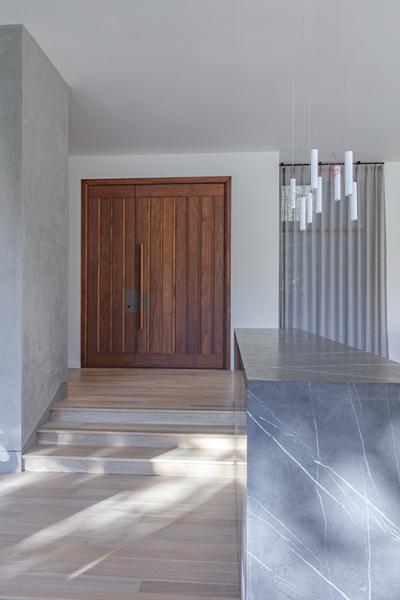
This project involved the complete interior renovation of a large 1970s modern house. At over 7,500 square feet, it didn’t need any additions, and architect Marc McCollom, AIA did not want to make major changes to the exterior. The house was well constructed, and its overall form was good.
But the interior was completely different: a rambling conglomeration of discrete rooms that seemed to go on and on without any guiding principle. The primary design task was to organize the plan and clarify the relationships among the various rooms.
The architect took the approach of balancing two somewhat contradictory strategies. First, removing a few small rooms to create a continuous view from one end of the house to almost the other. This visual connection gives you a sense of where you are, and the openness lets you feel the grand scale of the house. The architect took a similar approach with the master bath, creating a generous, light-filled space in what had been a warren of separate rooms.
In contrast, the middle of the house was too connected, with only some dangerous steps between the two living rooms. It needed a physical separation that kept the visual connection intact, and the idea of a large stone box felt right, with the material itself providing the beauty. Conceived as a continuous surface, the seamless top waterfalls down to become the ends. But its sides intentionally display the planar nature of the material, with joints that show the individual slabs and reveal their thinness. Two similar boxes, each coordinated with a plaster fireplace wall, tie the three middle rooms together while clearly defining their separate identities.
ADMISSION
Base Pass $30 : six livestreamed architect-led home walk-throughs with Q&A, PLUS video interviews with owners and architects.
Base Plus Pass $45 : Benefits of Base Pass, PLUS Matterport 360 virtual tour walk-through experience.
VIP Pass $60 : Benefits of Base Plus Pass, PLUS t-shirt and swag bag
A La Carte Items:
Tour of Homes T-Shirts $15
Tour of homes Bag $15
*Please select the Shipping add-on for any merchandise mailing orders.
WEEKEND TOUR SCHEDULE:
October 24, 2020
10:00 am : Sumner Bohannon House | Malone Maxwell Dennehy Architects
1:00 pm : Strait Lane Residence | DGA – Douglas Guiling Architect
4:00 pm : 1970s Modern in Bent Tree | Marc McCollom Architect
October 25, 2020
10:00 am : House Reimagined | Bernbaum/Magadini Architects
1:00 pm : Nimbus Prototype | Nimmo
4:00 pm : Parks Estate | Norman Alston Architects

