Linear Abstraction at Barry Whistler Gallery

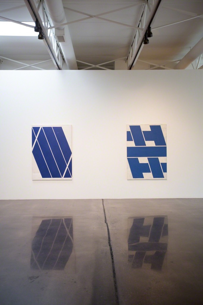
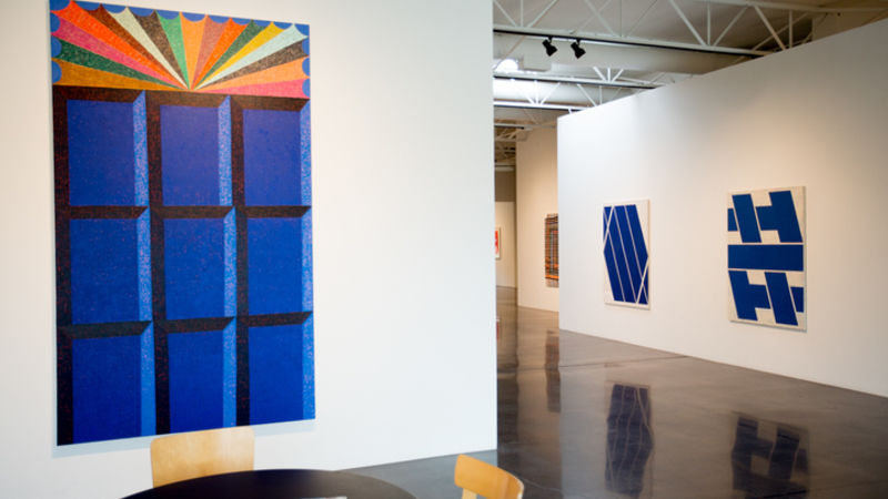
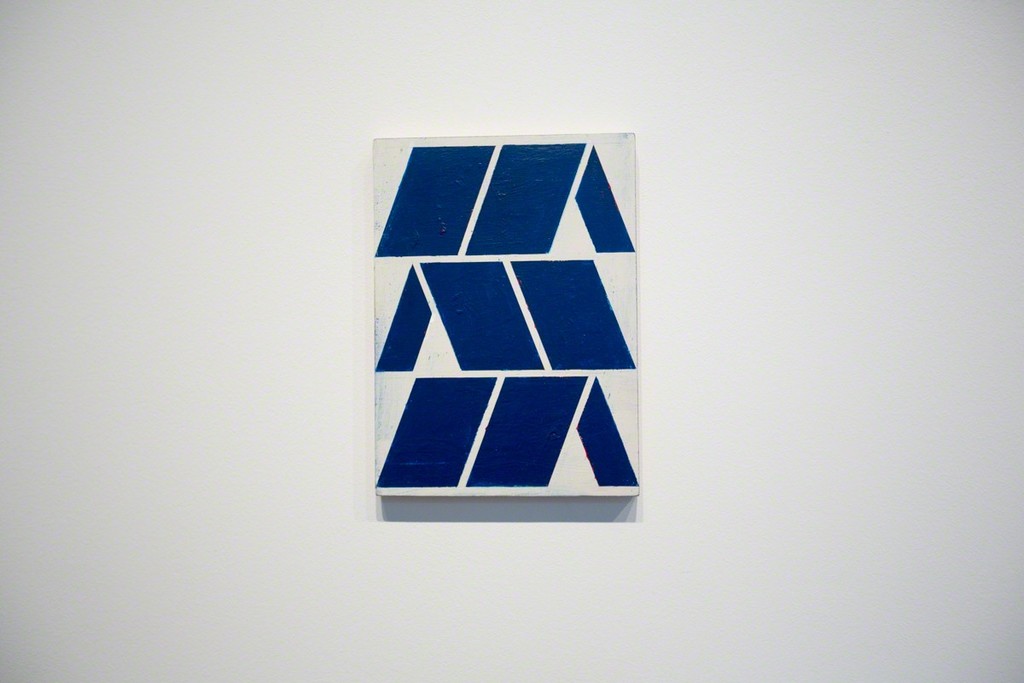
In defense of the strip, Barry Whistler Gallery has organized an exhibition of Linear Abstraction. The show includes Frank Badur, Alain Biltereyst, Nathan Green, Ellsworth Kelly, Matt Kleberg, Alicia McCarthy, and Kenneth Noland. When writing about the idea of a strip, I mean a wide line that is often in color. This show uses strips in varying degree of complexity, but essentially these paintings celebrate the fat line.
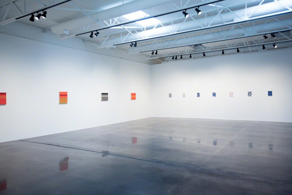
There is no danger of the strip disappearing as a subject matter anytime soon, yet is there really any point to play off of this aging trope? The show consists of seven artists, so I would say it that many voices feel the urge to give us their take on this simple act of expression.
Matt Kleberg brings an architectural element to his use of strips to create the illusion of space. I am reminded of the ornate theaters of the 1930’s, only Kleberg simplifies them into abstract portraits. He also explores arches that remind me of Roman architecture like the Coliseum. The arches are stacked one upon the other, surrounded by lines. He also has these forms that use the square waffle shapes. I felt I could just reach in and touch the side walls of his simulated spaces.
Frank Badur’s pieces are similar to the Kenneth Noland piece in use of space and composition. A simplified landscape color field is the idea behind both Badur and the Noland piece. I think the gallery is showing the continuity between the artists. They are showing us that this exploration of the strip is rooted in the abstract artists of High Modernism. This is also the reason Ellsworth Kelly is included in the show. Noland and Kelly tell us the source while Badur tells us about some of the further explorations in creating the strips of color.

Alain Biltereyst and Nathan Green go heavy on blocking in strips of color. Only Biltereyst keeps it simple and clean, while Green allows elements of gradience and chance drips to enter the work. Biltereyst lets you rest your eyes with quiet whites, soothing blues, and a slightly disruptive pink. I can meditate on Biltereyst’s work the gather some energy to meet the day from Green’s painting.
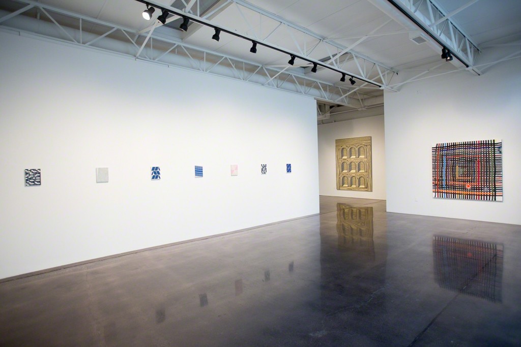
Alicia McCarthy approach is weaving the strips into a grid pattern. Thus these strokes of paint lose their strip quality for a more rhythmic structure that is rooted as far back as early human history where people were creating baskets by weaving reeds together. McCarthy continues this idea, only with the benefit of human history and the ideas of abstraction. Thus her work is more of the Now and draws from history with a wider net than any other artist in the show.
 
I don’t know if this was really a defense of the strip. But maybe their needs to be, because such a fundamental action in painting still has room for exploration. The Linear Abstraction at Barry Whistler Gallery ends on May 26th.

Compare listings

Compare