I never would have imagined an artist embodying the spirit of Art Nouveau while combining it with the softly edged geometric forms of High Modernism until I met John-Paul Philppe and saw his work. The Art Nouveau spirit is the idea that all things flow together to fully form a building, design, sculpture, or painting. All the arts complement each other. By the time Modernism reached its zenith, many of the disciplines were being separated and a return to hierarchy of mediums was creeping back into art. Though the philosophies diverged, it would seem Philppe returns back to the spirit of complementing arts by using forms similar to those with abstract painting and design.
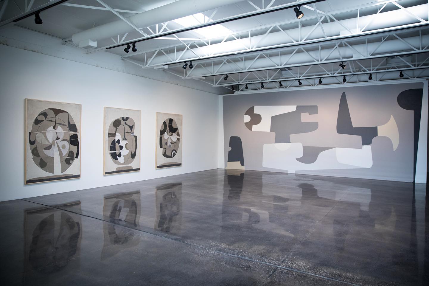
Consider the current show of paintings at Barry Whistler Gallery, from this exhibition you might assume he is a painter. However, the moment I met him he was talking about his sculptures and how this work informed his paintings. Little did I know, he has also installed works in department stores, as part of the architectural facades, and activating a staircase with his form. His vision of shape and form goes to the heart of design merging with fine art. Even this show hints at his many talents with a masterfully designed mural painted on one side of the gallery. I should have known of Philppe’s work. After all, his first solo show with the gallery was in 2012 and Philppe has been showing in group shows dating back to 1989.
Born in Oklahoma, John-Paul Philippe had lived and worked across the United States before settling down in Connecticut and New York City. Several key developments from his past lead him to a career in blending art and design. He illustrated for Neiman Marcus, then moved to Santa Fe to focus on painting. After a visit to London, he discovered the Bloomsbury group which was an art collective during the early 20th century. Philippe saw them embody this idea of arts fused together. Bloomsbury was the English version of the Art Nouveau, in that art hierarchies were beginning to be questioned, and pathways to fuse the arts began in earnest.
Two personal events also shaped this new body of work. One, he almost drowned and two, he met someone. John-Paul Philppe recounted a story to me about how he was making paintings and sculptures about islands, but he hadn’t been to an island. So, during a cold winter, the water near where he works had frozen all the way to an island. “I walked out on the ice and as I was walking something told me to jump, so I did. The next thing I heard was a crack, and a circle of ice broke, and my legs were in the water.” He told me he went underwater and sank into the mud. After he got out he was sick for a time, but when he recovered he returned to work with a renewed vigor. He then met someone that now assists him with his art production. Philppe told me that his assistant is not trained in art, and many times doesn’t do things so precisely, but this has become something positive. Philppe may have needed perfection in the past, but it would seem he is learning to let go and also give up some control. It turns out that this new attitude toward art-making appears to have lifted a weight from him.
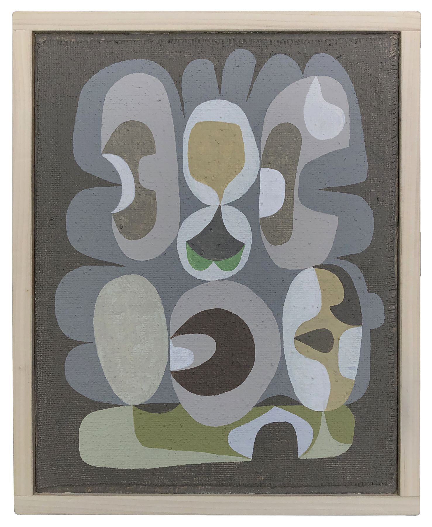
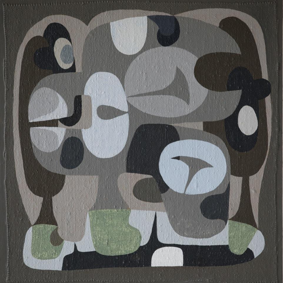
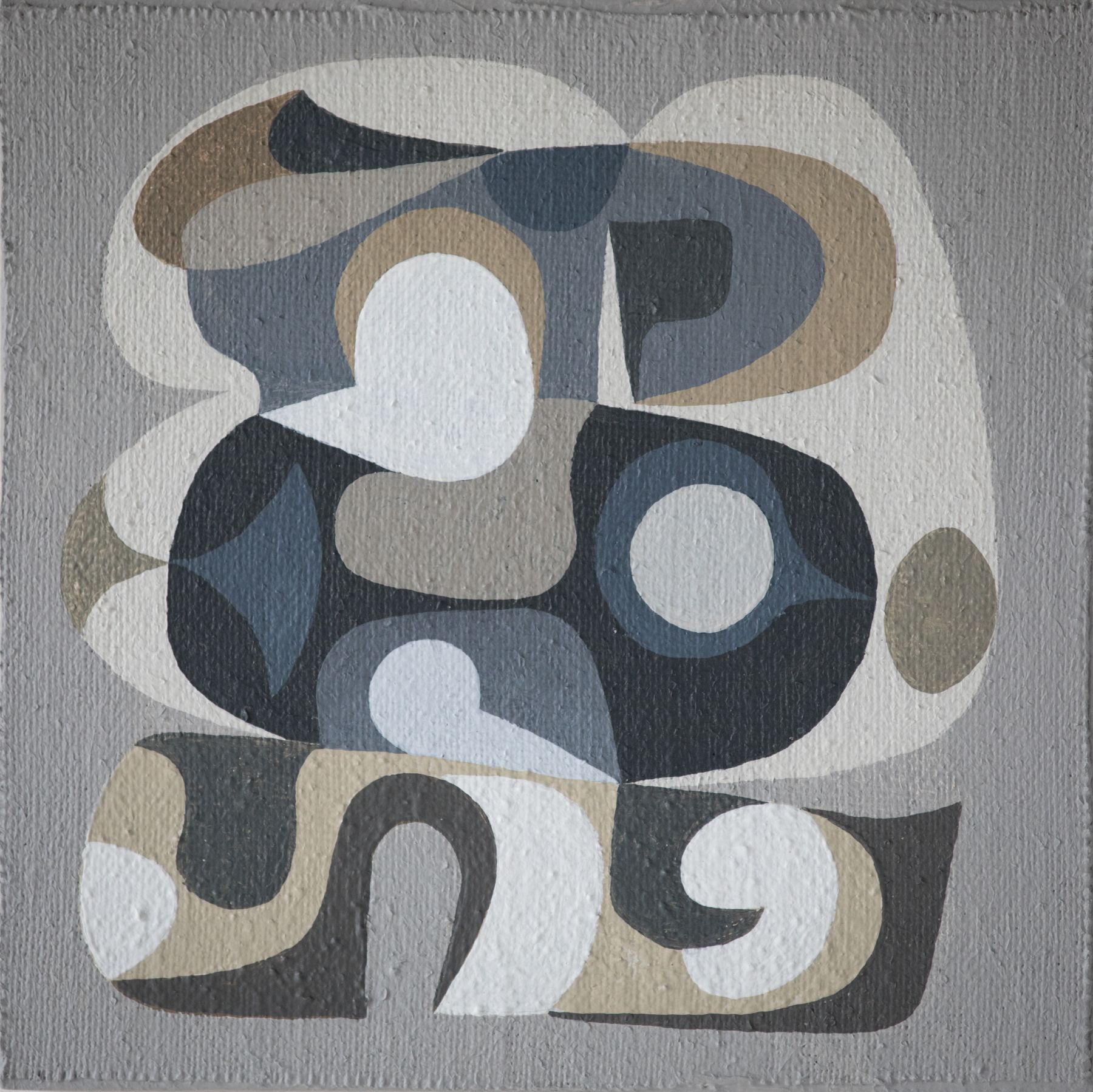
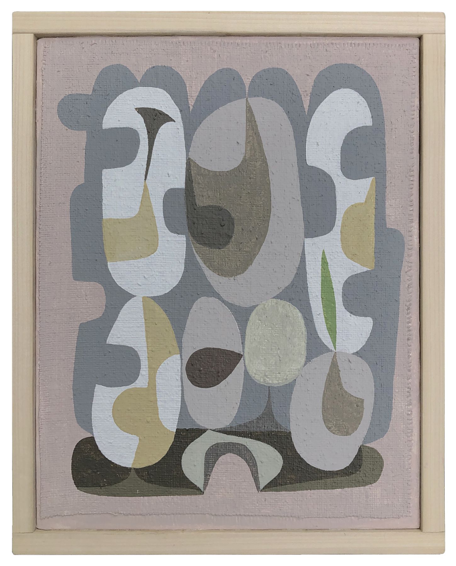
So, what about these paintings? What caught my attention is the work itself. I think it started with smaller works. His canvases are cut and mounted to boards with the ragged edges exposed. Then, inside are cleanly painted shapes that use line and shape to flow in and out. Positive and Negative shapes hold equal importance while two large shapes encompass them all. You could imagine these flatforms being an island from the bird’s eye point of view. Or maybe a similar view of an ancient Egyptian tomb fragment depicting a pond from top and side views simultaneously. I am thinking of Nebamun’s estate garden painting at the British Museum.
In the large gallery are three paintings that use collage to form imagery similar to the small paintings. Philppe said his assistant didn’t cut some of the work quite as precisely as he instructed, but he just went with it. The bottom of each work was cut short, so Philppe added a color strip to each and it grounded the paintings perfectly. I saw a gleam in his eye as he described how his new processes were challenging him to allow things to happen. The three works not only look like his island series but also seem to take on a kind of abstract portrait of a person. At least that is what I first saw in the work. Somehow the torn and cut college images started to feel like faces to me. Or maybe it was the pareidolia effect that was at play.
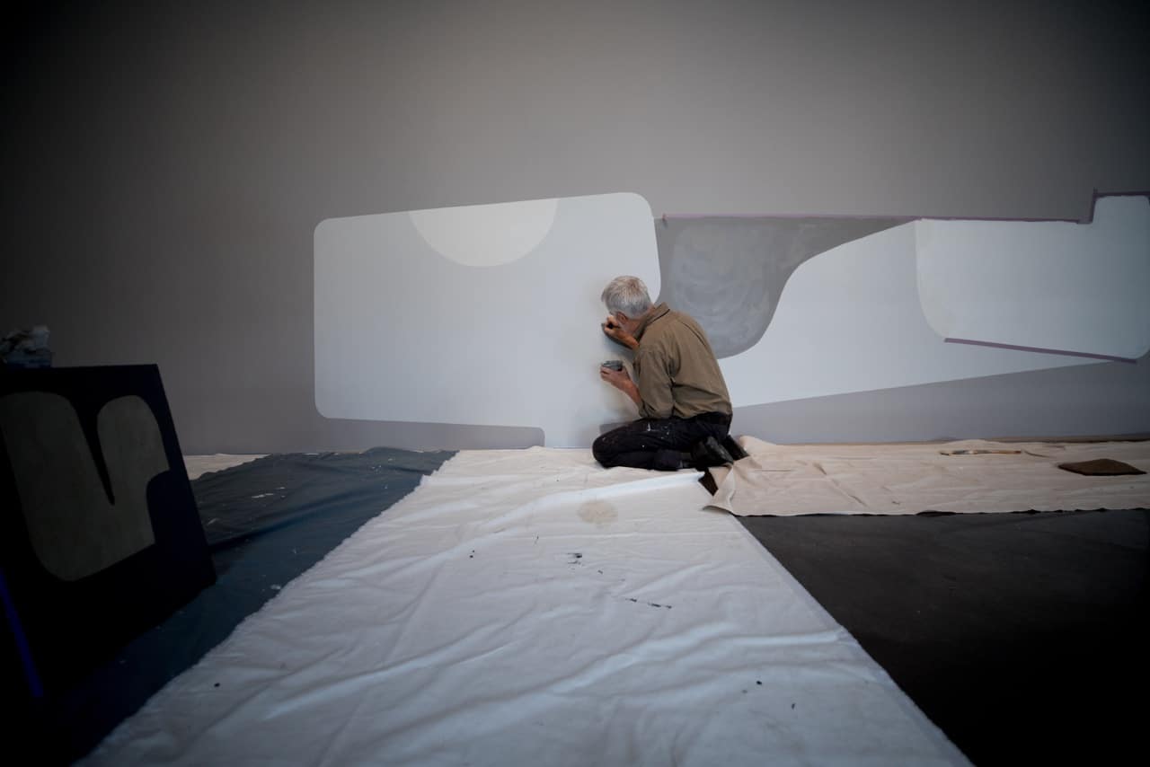
I can’t shake the feeling that his paintings feel familiar, but look fresh. His story of renewal was compelling and inspiring. It brings me to the conclusion that his paintings are more than meets the eye.

